Cohesity
Cohesity, a leader in data center and cloud management, needed a website to clarify their technical solutions and outline their platform.
LEAD DESIGNER
user experience | information architecture | wireframes
1
INFORMATION ARCHITECTURE / SITEMAP
The information architecture was redesigned to accomplish the following: show visitors the detail they want, generate leads, and indicate Cohesity’s shift from a hardware company to a software company. The types of users were also kept in mind. It was crucial to ensure that all users would be able to use the site effectively - from tech gurus, concerned with hyperconverged secondary data storage, to operations folks, who are driving business efficiency.
SITEMAP
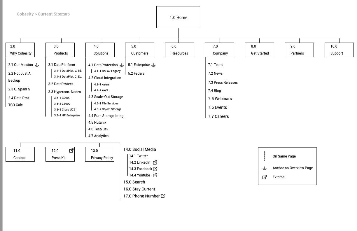
The first step was to build out Cohesity’s current sitemap to account for all pages and analyze the structure of their site.
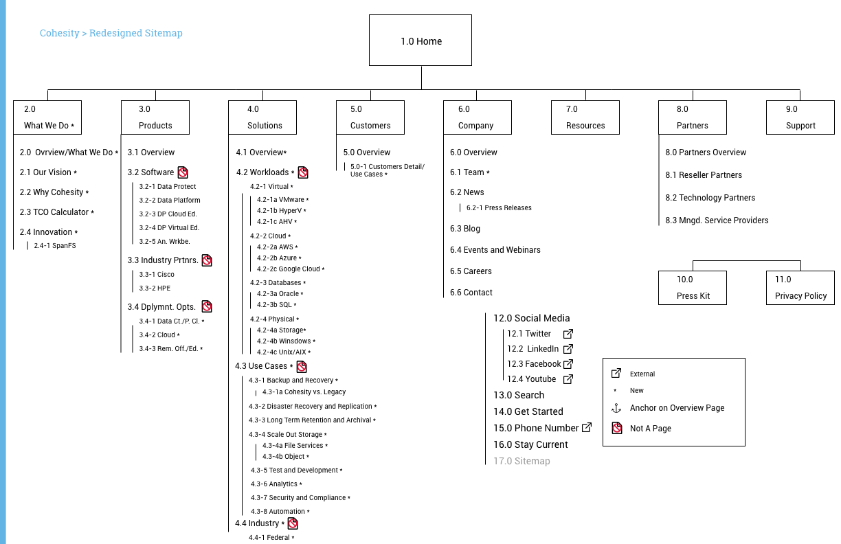
Next up was the new, redesigned sitemap. The new sitemap was restructured to generate leads and instill Cohesity’s focus of being a software company as opposed to a hardware company.
Click the arrows to compare the old sitemap vs. the new sitemap.
NAVIGATION AND DROP DOWNS
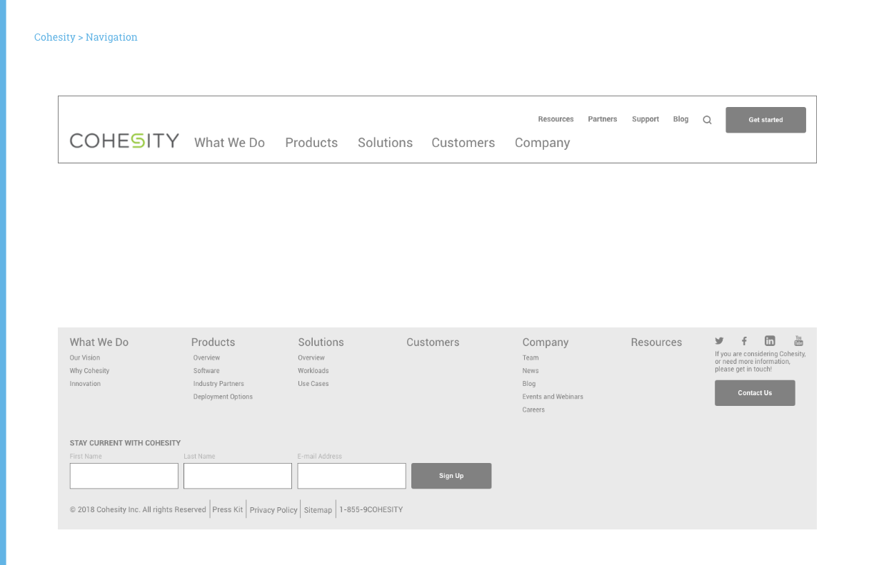
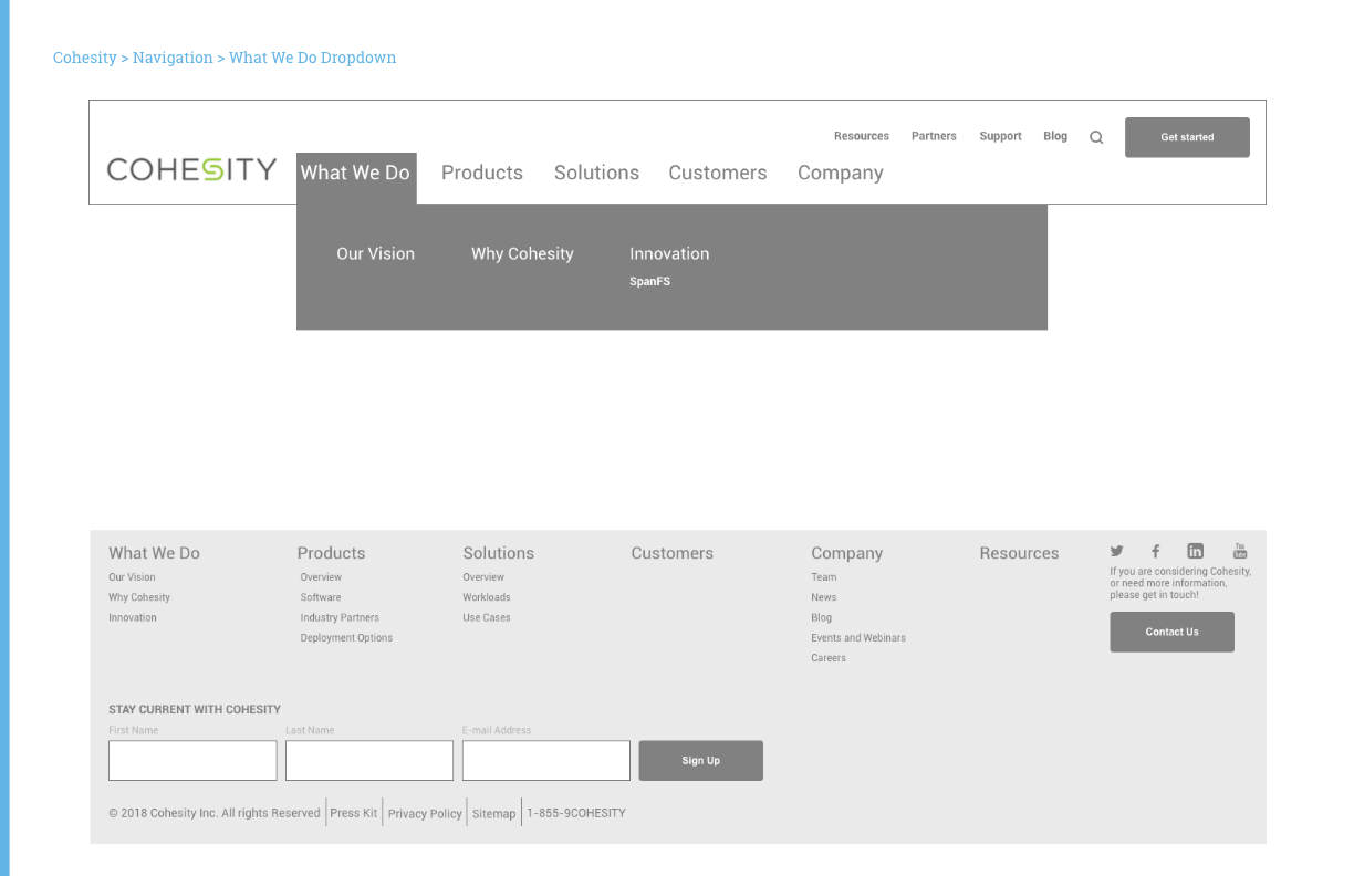
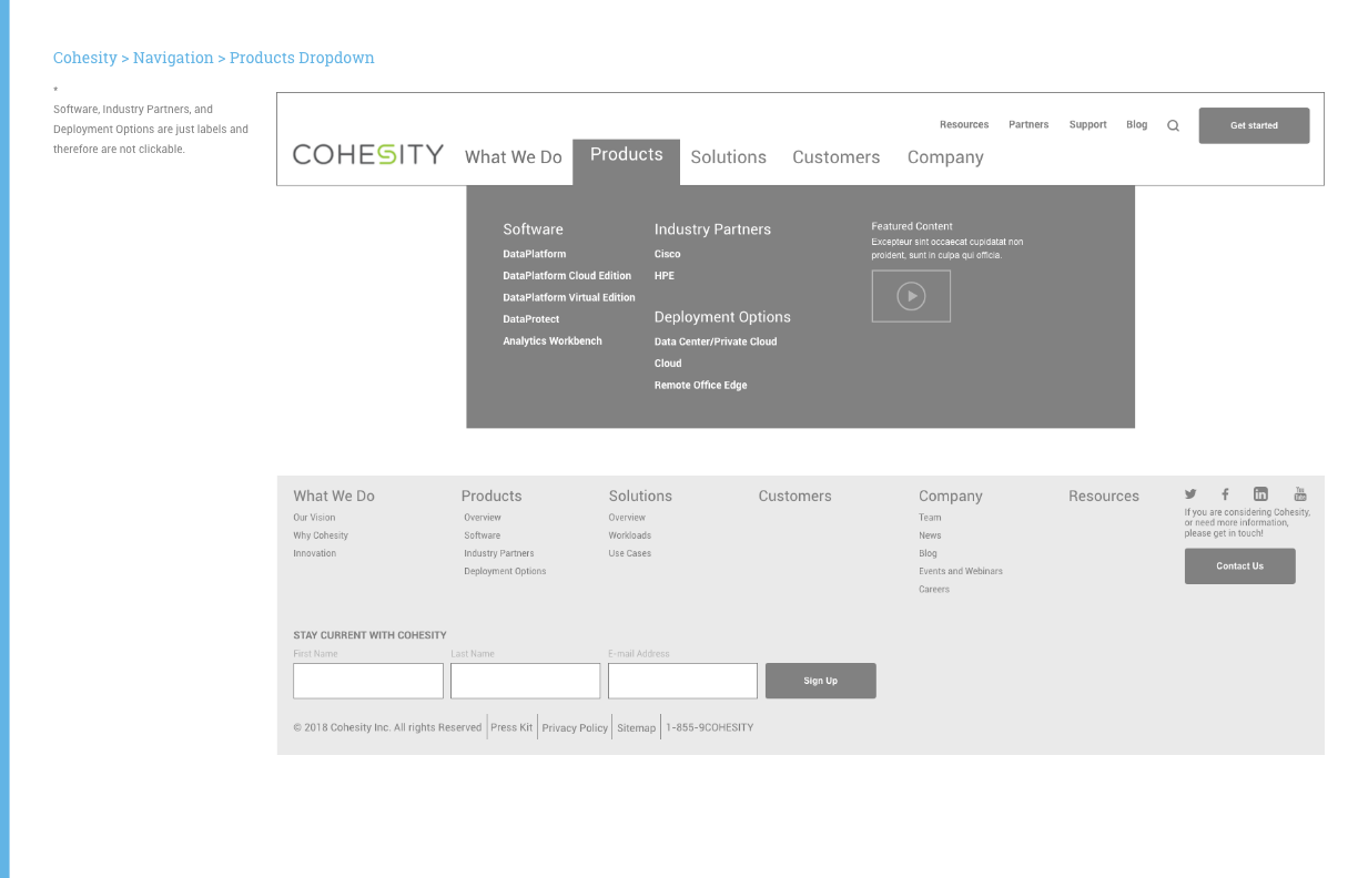
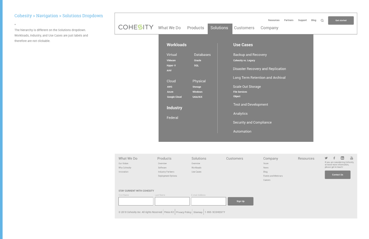
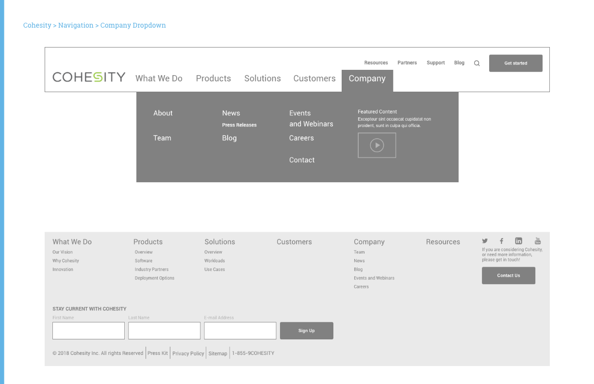
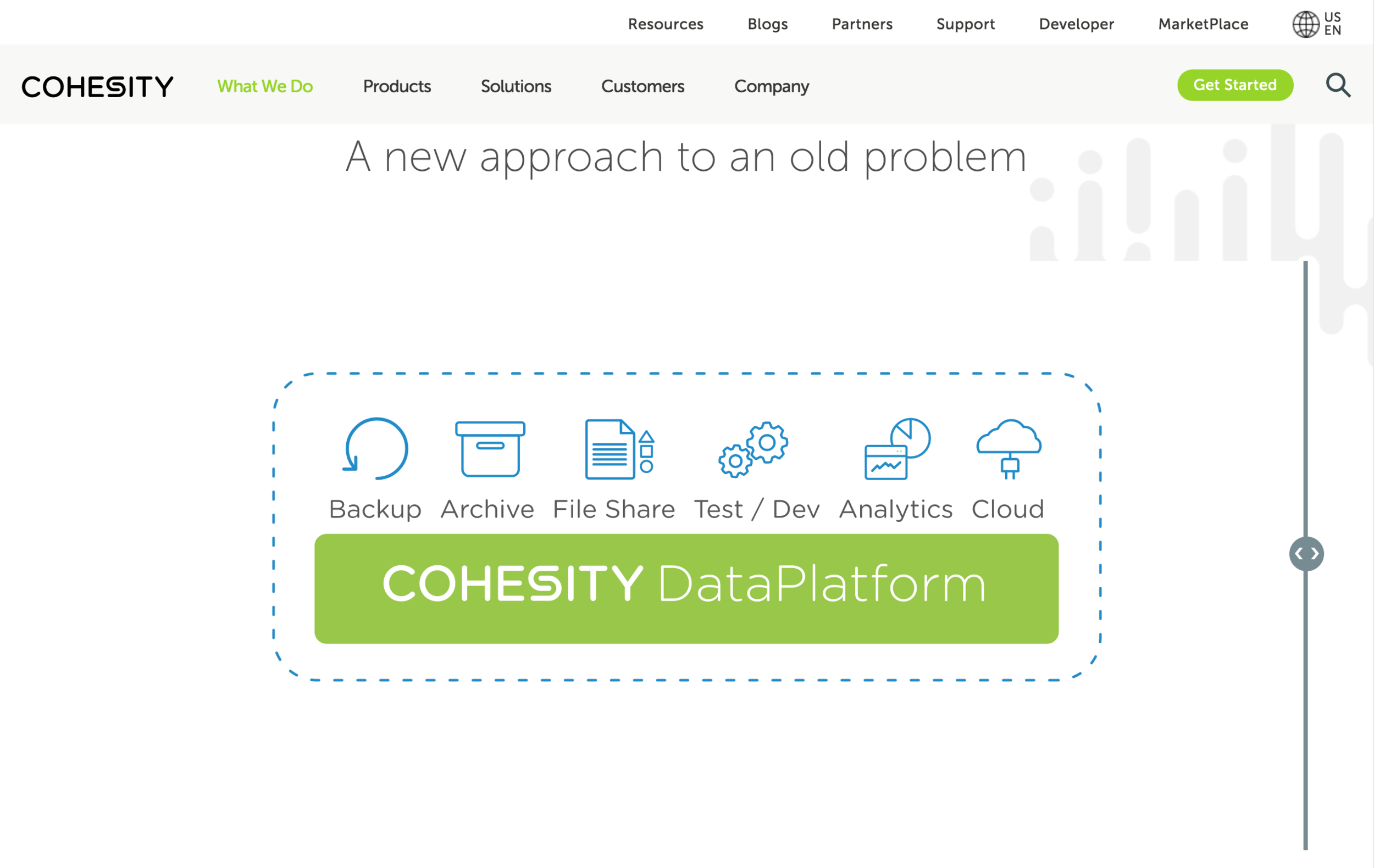
The navigation consists of a utility menu on the top right and a standard left-aligned main menu.
The utility provides easy access to resources, partners, and support, as well as search and a main call to action button (CTA). This was a research-based decision; data analytics revealed that users often seek out these items. Blog was also included as Cohesity planned to publish content more frequently.
The order of items in the main nav was strategically decided. ‘What We Do’ was placed first to put Cohesity’s vision and expertise at the forefront. Providing users with a clear company story was a top goal.
2
WIREFRAMES
Wireframing was the next major task after the sitemap and navigation were approved. I examined the current site page-by-page to determine which pages had similar content and could potentially have similar page structures. From there, I created a list consisting of 30 templates.
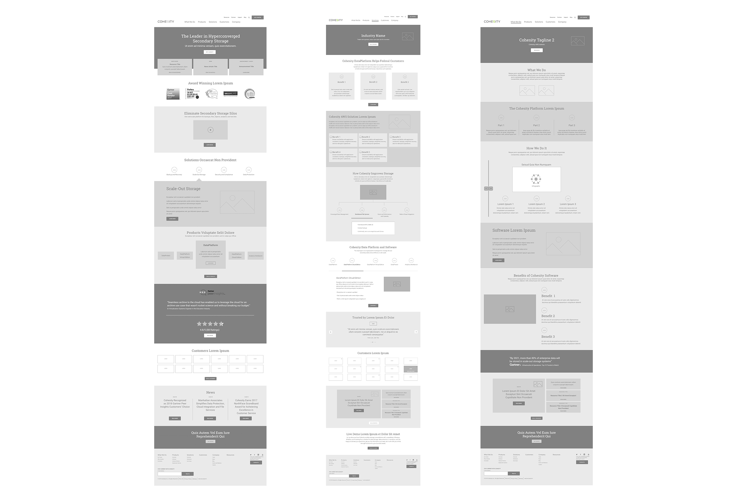
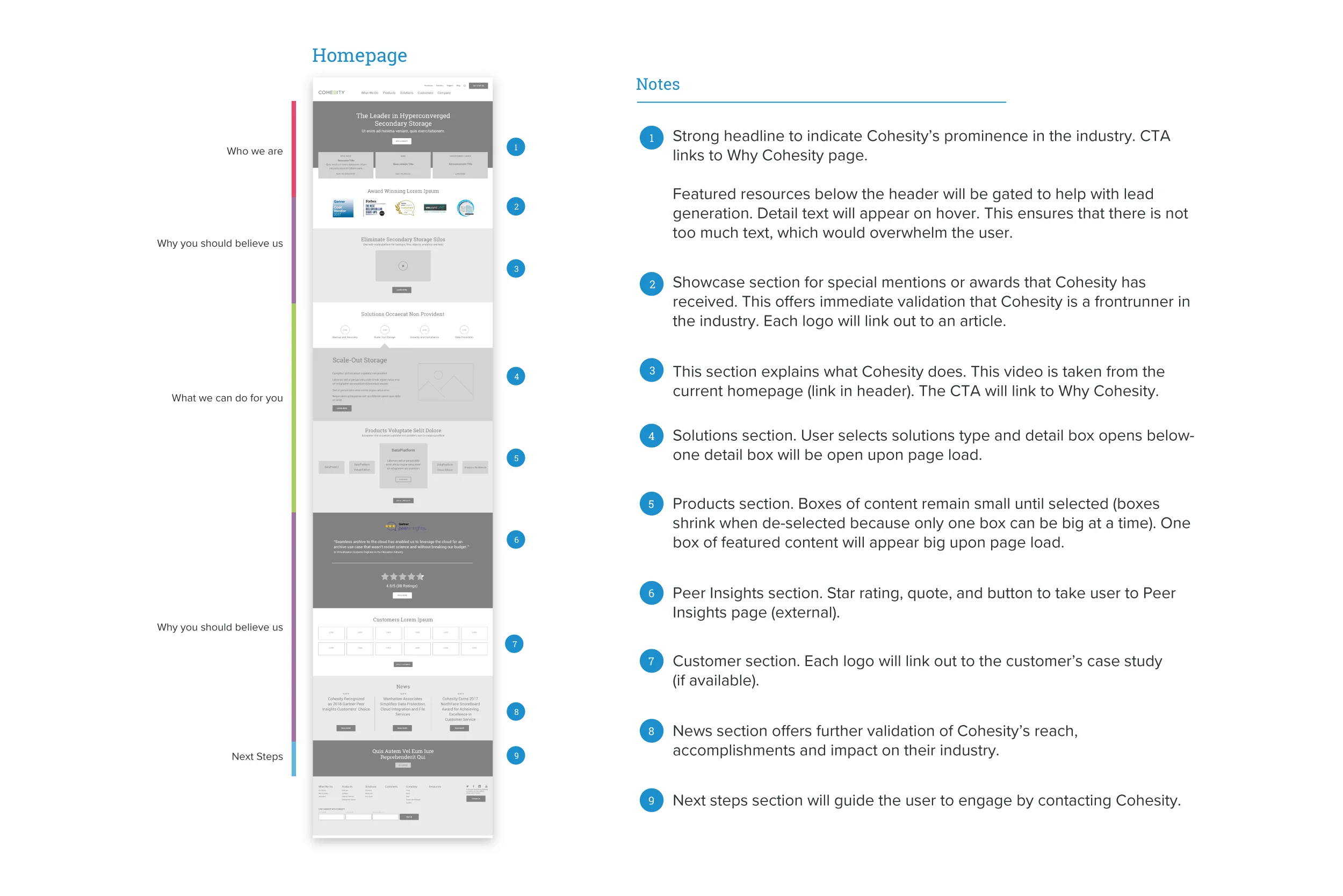
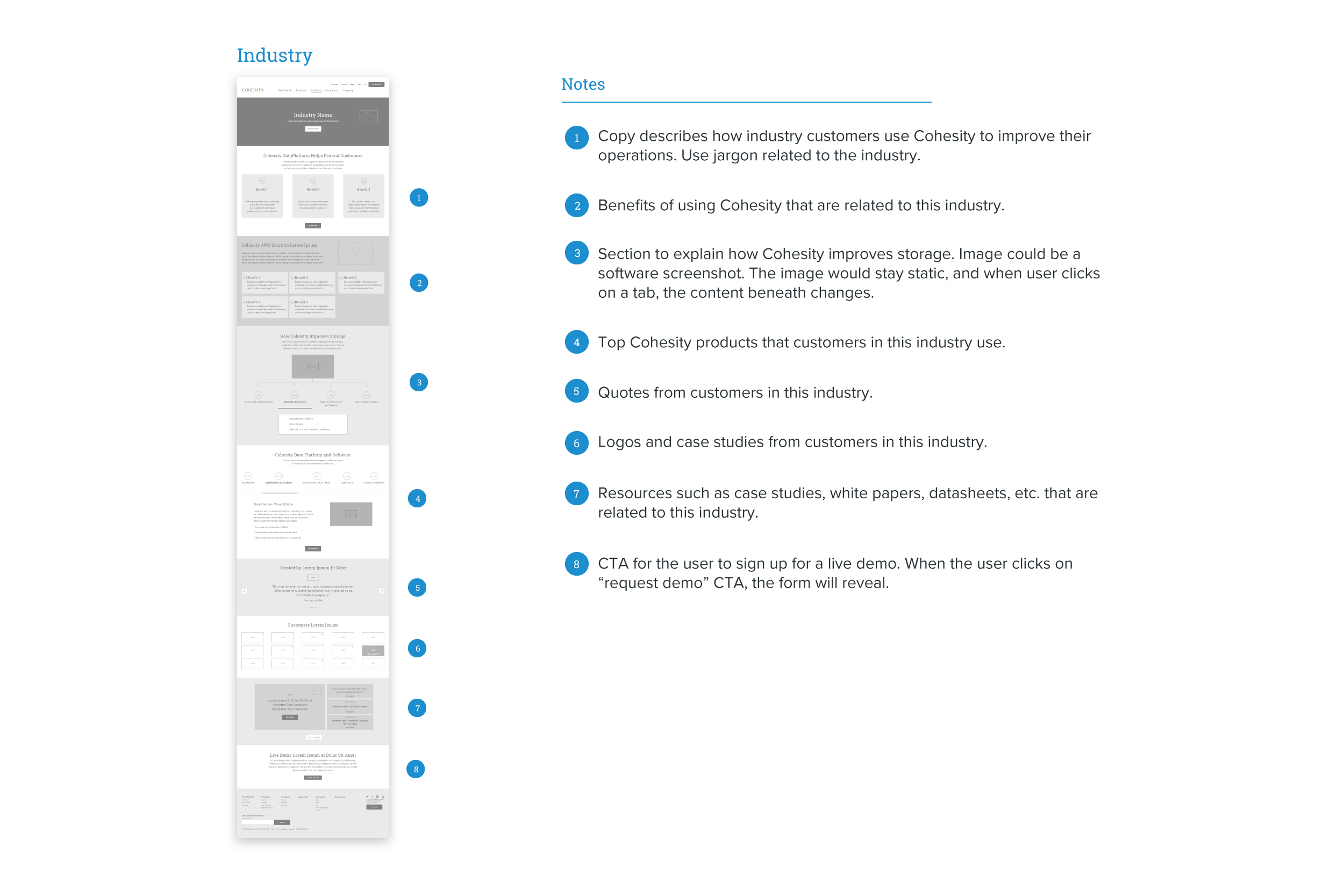
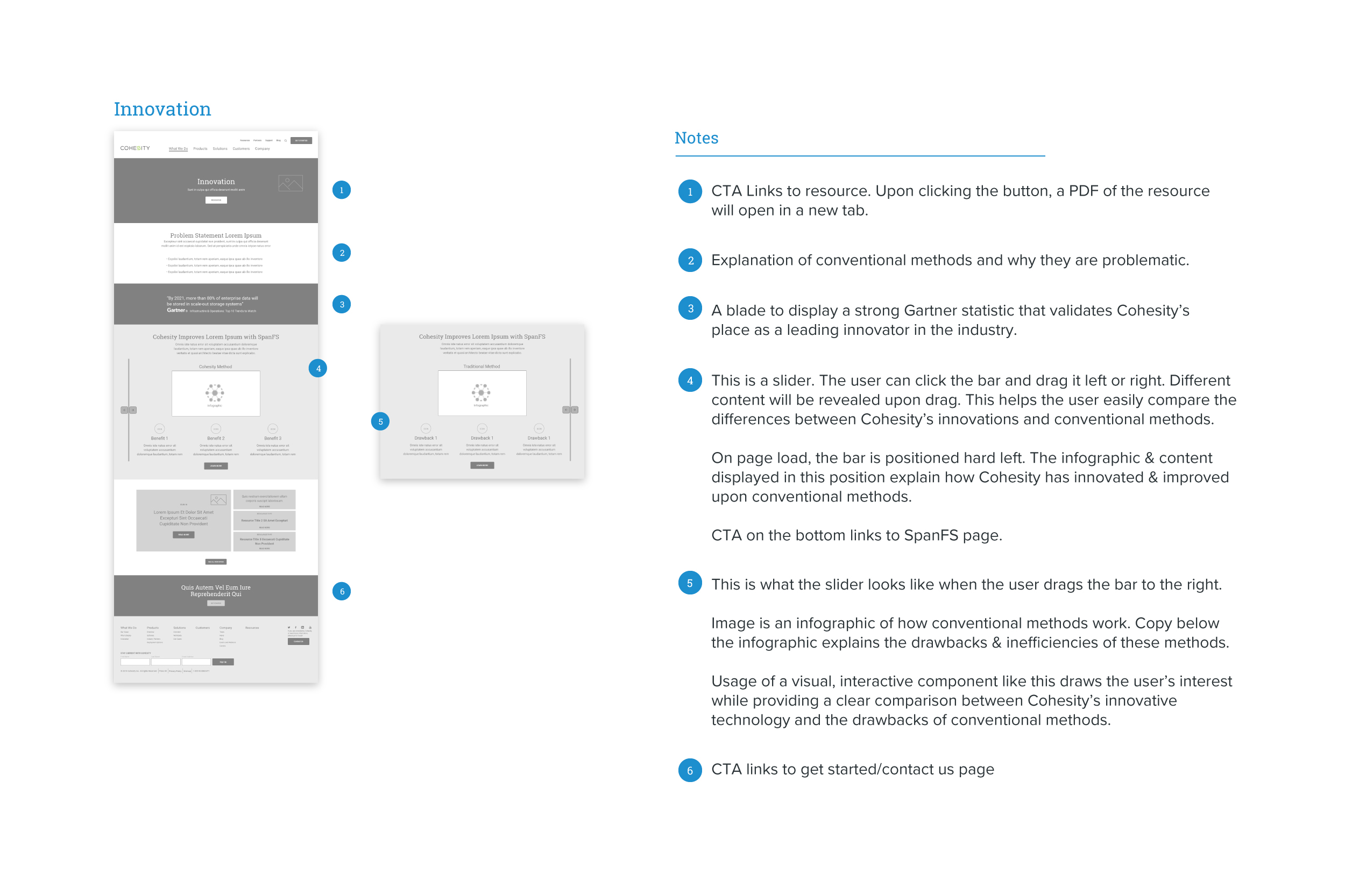
Other top priorities were governance, consistency & scalability throughout the website. To accomplish this, I created a number of design components that could be reused on various pages. I also ensured that these elements could be easily manipulated in the event that content needed to be added or removed.
3
DESIGN
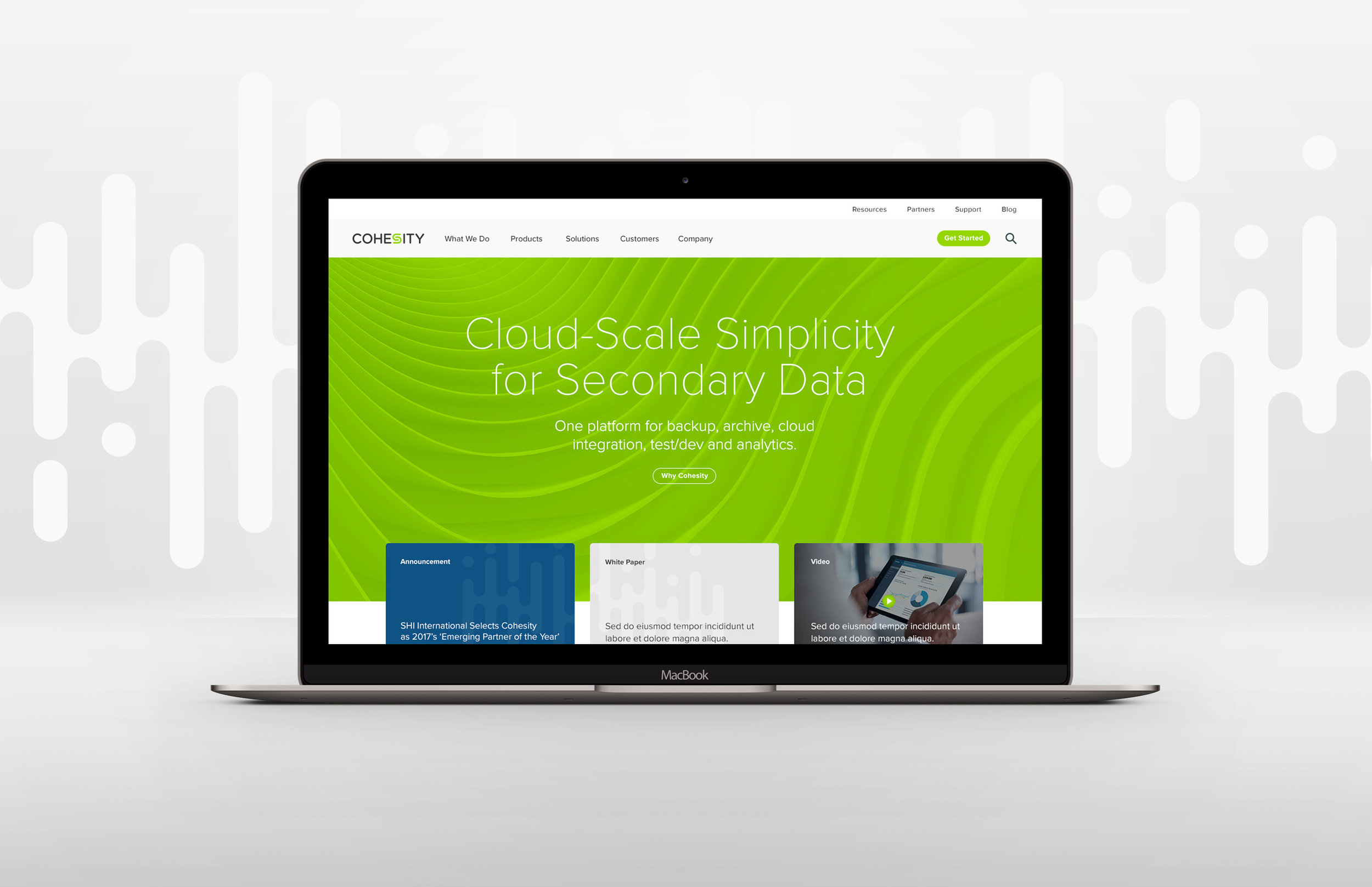
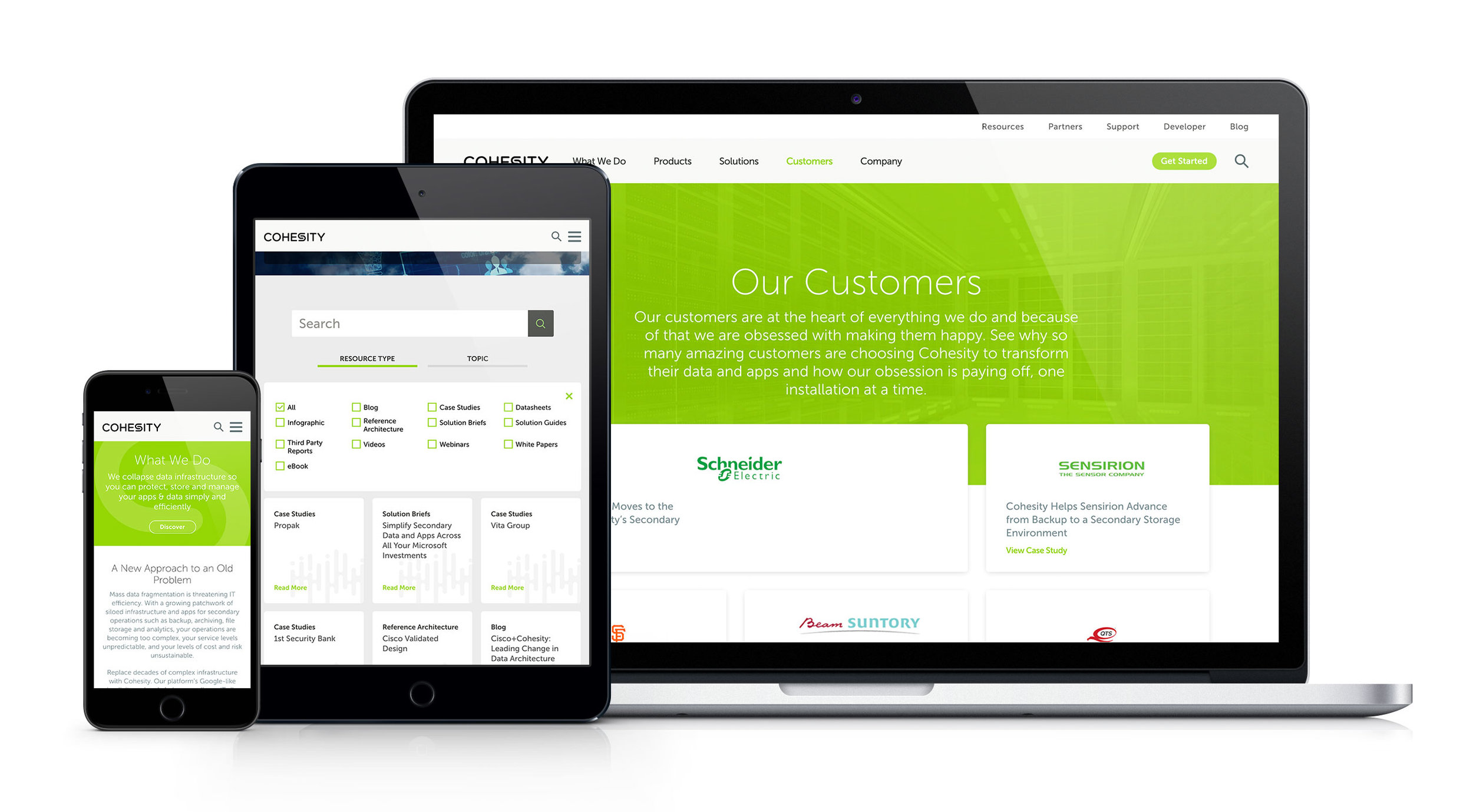
Utilizing an agile process allowed this large scale project to move more quickly. Wireframes and design were tackled concurrently. Throughout the project I was simultaneously tasked with creating new wireframes, editing previous wireframes, handing off approved wireframes to the visual design team and reviewing visual designs to ensure that UX priorities such as key functionalities and page structures were being honored.

4
DEVELOPMENT
In keeping with the agile process, each page design was handed off to development upon approval. My QA efforts included checking that interactions were functioning properly and serving their primary purpose.

